light-header
Number Thirty-Seven of an Ongoing Series by Dick Henrywood
Having taken a longish break from producing these “Highlights” articles, I have decided to treat myself and combine three of my own particular interests, namely jugs, transferware, and lustre.
Everard, Colclough & Townsend
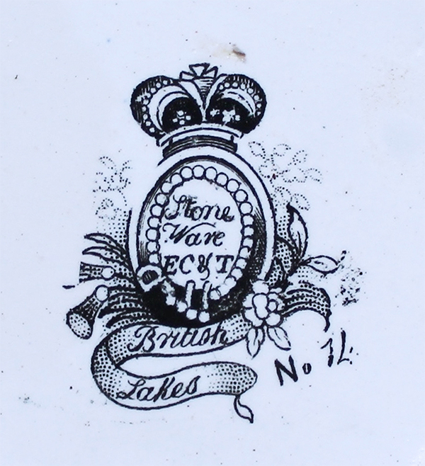
The little-known and short-lived firm of Everard, Colclough & Townsend worked in Longton, probably from about 1840 through to the end of June 1845. At the time of writing, the TCC database has no records of any wares from the factory – possibly they had little trade with America – but they certainly made some distinctive transferware jugs. They feature typically ornate shapes of the period, transfer-printed in black with various patterns, but washed distinctively overall in pink lustre. They are usually marked with a crowned belt enclosing the trade name and maker’s initials “Stone / Ware / EC & T”, with a pattern title on a ribbon beneath and a pattern number to one side (figure 1).
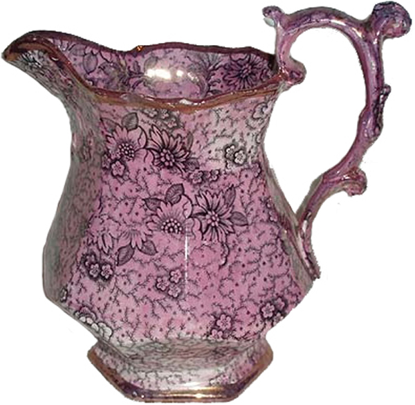
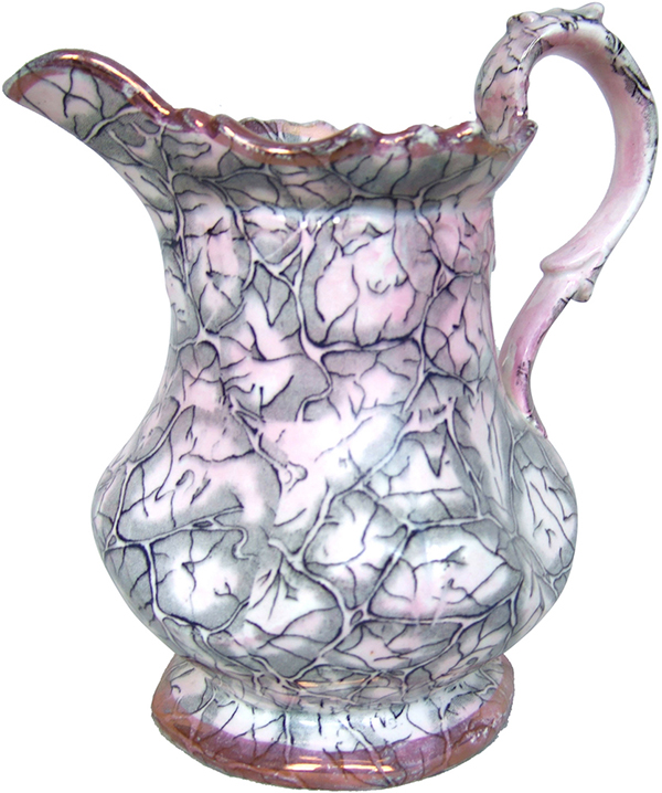
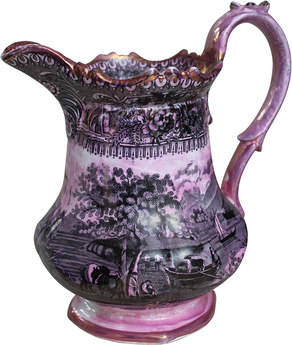
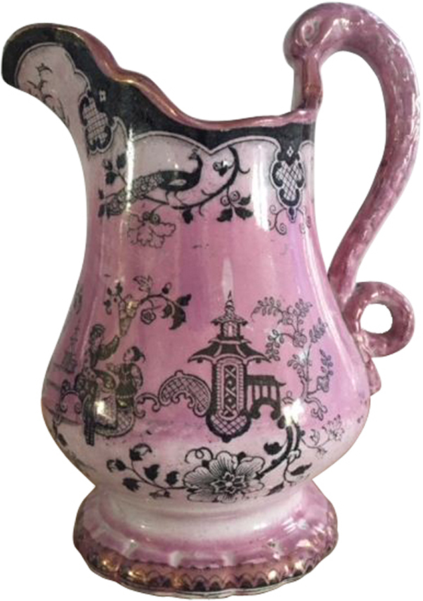
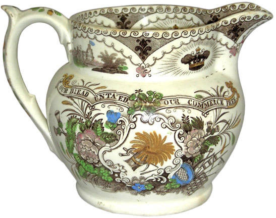
Three good examples are illustrated here, with patterns titled “Passion”, marked with pattern number 4 (figure 2); “Marble”, with pattern number 12 (figure 3); and “British Lakes”, with pattern number 14 (figure 4). A fourth similar jug is also shown (figure 5) titled “Chinese Temple” but with a simpler mark and no pattern number. The mark still includes the initials EC & T but one example has been noted with the initials changed to E & G, indicating the succeeding partnership of Everard & Glover. The firm did make non-lustred jugs too, and an example illustrated here promoting Free Trade is titled “Plenty”, with pattern number 17 (figure 6). The mark is much as before, but with the initials moved to join the title on the ribbon beneath the belt.
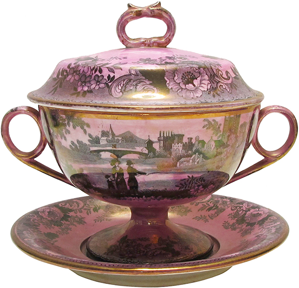
Although the firm’s lustre wash is distinctive, it was not unique to the Everard firms and a really good example of Davenport’s “Durham” pattern is shown here on a sauce tureen, cover and stand (figure 7). This design was issued on a range of wares by Davenport, examples noted including a sugar box, coffee can, and a jug and washbowl set. The effect may be an acquired taste but it can certainly be quite impressive.
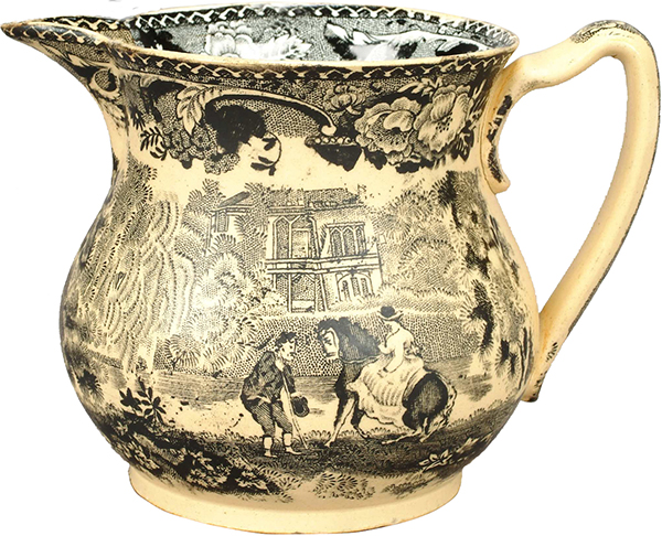
The technique of an overall wash was not unique to pink lustre. A final example shown here is a jug printed in black with two scenes from Bathwell & Goodfellow’s “Rural Scenery” series but washed overall in cream. My own feeling is that the result is far from successful – it just makes the jug looked stained!
I know this has been a bit of an excursion off the beaten track, but I do find these jugs fascinating. I would be delighted to hear of any other examples, and indeed any other wares by Everard, Colclough & Townsend (or their successors Everard & Glover). A small firm, but not without interest. Contributions should be sent to Dick Henrywood via the usual email address: henrywoodshighlights@transferwarecollectorsclub.org).
My thanks to Judie Siddall and Robert C. Bennett for help with images.
(Click on images for a larger view.)
 |
 |
 |
 |
| Figure 1. A typical mark, from the “British Lakes” design, showing the pattern number 14. | Figure 2. Jug titled “Passion”, pattern number 4. | Figure 3. Jug titled “Marble”, pattern number 12. | Figure 4. Jug titled “British Lakes”, pattern number 14. |
 |
  |
 |
 |
| Figure 5. Jug titled “Chinese Temple” (no pattern number). | Figure 6. Two sides of a jug titled “Plenty”, pattern number 17. | Figure 7. Sauce tureen, cover and stand by Davenport in their “Durham” pattern. | Figure 8. Jug with two of Bathwell & Goodfellow’s “Rural Scenery” scenes, washed overall in cream. |
Rich with content for ceramic collectors, researchers, authors, curators, and historic archaeologists, the sites are sure to deliver value for their visitors. The exhibition’s curators continue to enhance them and, now, with site application upgrades, including a new magnification feature and upgraded content management capabilities, the TCC and its collaborators are pleased to relaunch these exhibits, all free to a worldwide audience.
Branded Patriotic America, debuted in 2014 in collaboration with Historic New England, and the Winterthur Museum
Launched in 2015 in partnership with the Northern Ceramic Society.
 Not a member but want to receive email updates?